Saturday 20 September 2014

Red Moon by Carlos Trillo and Eduardo Risso


Red Moon, a flame haired princess meets a travelling acrobat, Antolin, and they form an unlikely friendship, setting off on several quests together, in a medieval world of magic, witches and fairies.

The protagonists are both around ten years old, and the book is aimed at this age group. Drawn in a typically Bande Dessinée style, the Argentine author and artist are obviously drawn to this European tradition, rather than the American comic book.

Carlos Trillo, who died in 2011, was a prolific writer, collaborating with many notable artists, and this is one of several efforts with Eduardo Risso (of 100 Bullets fame). Originally published in four editions by SAF Comics, they have now been brought together in an omnibus edition, and should have enough excitement, fantasy and adventure to satisfy most young children.

It is good to see this kind of European comic book on sale in the UK (I bought it from Forbidden Planet, in Shaftesbury Avenue, London) and Risso’s artwork is accomplished, his lines part pen, part brush, he draws the characters expressively, and  I cannot fault his drawing, his research, nor his style.

If I did have to find a fault, it would be the colour, which is very ‘photoshopped’, with very flat areas of colour and very precise graduations. To make things worse, it is printed on gloss paper, which seems to emphasise this crudeness.

I also found it clumsy in its ‘story boarding’, and at times it seemed too hurried, and I think it would have been better if it had tarried somewhat at certain points of the story, and if the creators had spent more time acquainting us with the characters. I did not feel much empathy with anyone in the story, as they all seemed rather two-dimensional.

I also found the ending rather unsatisfying, not very believable and a bit of an anti-climax. I know the story is for young children, but they will still respond to engaging and believable characters and situations, as the early Asterix books atest.


Written by Mike Stonelake, illustrator, cartoonist and designer. See www.mikestonelake.com

Saturday 6 September 2014

Blankets by Craig Thompson


‘Achingly beautiful’ is how Time magazine described Blankets. It is a story about first love and self-awakening, tempered with regret for a lost childhood.

Craig and his brother Phil, the children of fundamentalist Christians, are growing up in a small town in Wisconsin. A skinny child, not interested in sport or Heavy Metal, Craig is marginalised and bullied at school, and an easy target for the teachers. As is common for those with extreme beliefs, the home and church become a refuge from the evil, sinful world, and they see themselves as the persecuted faithful.

The story revolves around the beautiful Raina, a mutual misfit he meets at ‘Church Snow Camp’, and the first stumbling steps of their romance, which blossoms as Craig stays with her during the holidays. Away from his parents, the pull of fundamentalism is diminished, and his guilty conscience is unable to put up much of a fight.

I have read the book three times now, and every time I also fall in love with Raina. Beautiful, sensitive, intelligent, creative, generous and fun. Is this nostalgia, for the perfect woman who does not exist, except as a memory?

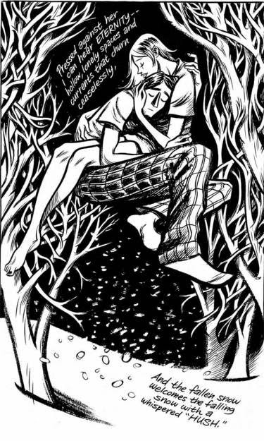
The beauty of Blankets is not just in the story, it is in the artwork as well. Craig is an accomplished artist, and worked for DC, Marvel and many other top publications. He uses brush and ink, working in black and white. His work has a strong line, which is never merely a contour, but a description of form and volume, light and shadow and expression and movement.

Craig communicates so much, sometimes without any words at all. In one scene, Raina’s devoutly Christian father, looking into the spare room one morning, seeing Craig’s bed neatly made, storms into Raina’s room and finds them in bed together, clothes strewn over the floor. Then he looks at the sleeping face of his daughter, seeing such contentment there, and maybe, reflecting on his own failures, backs out of the room, quietly closing the door behind him.

To what extent the hero of the book actually is one and the same as the author is difficult to say. He is an innovative story teller, not content to regurgitate mere facts. That said, it is so well observed that it must be grounded in true events and real people.

In Blankets, the events of his childhood are seen through the eyes of an angy, 24 year old man, and the book is cathartic, as he exorcises his demons and satirises his tormentors. Yet he is not blinded by anger – he has time for an affectionate portrayal of his parents, and he claims that he retains a belief in the teachings of Christ, if not the teachings of the church.

The things we angrily throw away one day, we later return to for comfort, as we realise that the adversity we faced as a child has made us the person we are today. I wonder if Craig would change one moment of his childhood, which has shaped him into a strong individual, and a talented artist and story teller.


Written by Mike Stonelake, illustrator, cartoonist and designer. See www.mikestonelake.com

Friday 29 August 2014

The Bloody Streets of Paris, by Jaques Tardi, adapted from the novel ‘120 Rue de la Gare’ by Leo Malet


“My name’s Nestor Burma. I used to be a private detective. Before the war I used to run the Fiat Lux Agency.” We are already 8 pages into the comic before our hero enlightens those of us that do not know, exactly who he is. Leo Malet’s character, the subject of 33 novels, is his most well known and best loved character, a household name in France, but little-known by English speakers.

The story unfolds in a German prisoner of war camp, Stalag XB, full of French soldiers after their capitulation to the Nazis in 1940. A mysterious prisoner arrives, unable to remember who he is or anything else for that matter. Needless to say, the mystery is finally explained in the denouement at the end of the book, and the complicated twists and turns are all satisfyingly put together.

Nestor Burma lives in a time that many Frenchmen consider Frances darkest and most shameful hour, when moral compromise was the norm, even for Hergé, for example, working for the collabative Nazi newspaper ‘Le Soire’. Burma, however does not compromise himself, keeping a disdainful distance from the Germans, and in fact, just about everyone. Usually wearing a frown, the best he can manage by way of a smile is a self-satisfied smirk or a wry grimace.

Tardi is a master when it comes to drawing believable faces and expressions. His characters are so real and lifelike, with the years of pain and disappointment etched into their faces, or indulgence, like the flabby face of the attorney, and sometimes, when Tardi is feeling kind, innocence and naivety.

He also draws the streets of Lyon and Paris, the huts of the stalag and the interiors of the rooms Burma visits, with great skill and meticulous research. The office of the policeman Bernier is one beautiful example of this, with typewriter, lamp, fireguard, filing cabinets and telephone, the two men framed by these details.

The book is black and white, with tones of grey, and Tardi’s excellent handling of light and shadow creates strong moods and atmospheres, such as the snowflakes falling against a darkening sky as they visit a country house, and the deserted snow-filled streets of Paris after the curfew, as they are caught in the middle of an allied air-raid.

The English translations of the graphic novels are quite hard to come by, although ‘The Bloody Streets of Paris’ is available on Amazon. It is 190 pages long, so a quite substantial book, beautifully drawn and well researched, which is the reason I keep on re-reading my copy.


Written by Mike Stonelake, illustrator, cartoonist and designer. See www.mikestonelake.com


Tuesday 10 June 2014

The Rainbow Orchid, by Garen Ewing


Any fan of Tintin will remember the childhood thrill of sitting down to read one of Hergé’s comic books for the first time, and I felt something of this when I saw Garen Ewing’s new series ‘The Rainbow Orchid’ in Waterstones.

Every Tintin fan will have been disappointed to discover Hergé only completed 22 colour albums, which is far too few. Although the poor quality of the Asterix books produced after the death of Gosciny, bear out Hergé’s wisdom to not allow new Tintin stories to appear after his death - and we must applaud Hergé’s wife, as the guardian of the Hergé Estate, for honouring Hergé's wish.

But now Hergé has an heir who is producing new, swashbuckling adventures, that we can freshly devour!

The mark of Tintin is all over these books: the boyish hero, Julius Chancer, the motley cast of characters, the 1920s’ setting, the villains, the exotic backdrop, the fast pace of the story, the A4 portrait format, with Hergé’s strict grid of four rows of pictures, and of course the ligne claire style, synonymous with the master!

Looking at the first pages of book 1, I am reminded of Hergé’s opening pages in Tintin in the Land of the Soviets – although Garen Ewing’s style is not as immature as the pages of this first Tintin adventure, there is an awkwardness in the pictures, which definitely improves as the book moves on. I also found the colouring crude in places, and not a patch on Tintin – look at some of Hergé’s moody evening illustrations, in The Black Island, for example, as Tintin arrives in Kiltoch. Such subtlety! The colour seems to be translucent layers, rather than one flat colour. I wonder if the advent of photoshop caused the art of colouring to be lost. Once it was a skill in itself, done with colour inks, using glazes and washes. Ewing’s colour can seem quite dead and flat, in comparison, but I imagine Garen does not have the luxury of a studio of young and beautiful colourists to work on his cartoons (including one Fanny Vlamynck, who later became Mrs Hergé), and probably has to do it himself!

In fact the great Hergé had script writers, gag writers, research assistants, artists to help with drawing and inking, and towards the end of his career he managed a large studio, rather like a film director, without actually doing too much himself.

Times have changed! Cartoons were once big business and did not need merchandising and films to give them a raison d’etre!

I particularly don’t like Ewing’s clouds – they almost look like a different style. I also did not like the way some lines were coloured, and felt it would have been better to stick with black, rather than introduce a technique that is more Disney than Hergé. However, while comparisons with Hergé will inevitably be unfavourable, and the fact is that the best of Ewing’s drawings do come close – the station at Karachi and the truck driving down the street on page 7, both in volume 2, are both excellent examples of Ewing’s work, with attention to detail, great research and beautiful colour.


Ewings’ story writing and dialogue is certainly adequate, although the characters don’t seem to be very rounded, and you have little impression of their personalities, and therefore little emotional involvement with them. I wonder if this is because the plot is over complicated, and a lot of explanation is required, leaving less room for character development.

Despite my criticism, I salute Ewing’s attempt to bring a new series into being. He has set himself the highest challenge, and made an excellent start and am already looking forward to reading the third volume of this adventure.


Written by Mike Stonelake, illustrator, cartoonist and designer. See www.mikestonelake.com


Monday 9 June 2014

The Adventures of Hergé, by José-Louis Bocquet, Jean-Luc Fromental and Stanislas Barthélémy


Tintin and his creator Hergé have always have legions of admirers: Charles de Gaulle once said ‘my only international rival is Tintin’. Pop artists Andy Warhol and Roy Lichtenstein admired his comic strips, as have almost every comic book writer that has followed. Seth, in his picture novella ‘It’s a good life if you don’t weaken’ wrote the memorable line “Whenever I see a train, I think of Tintin”, and many comic book readers and creators see life through Tintin-shaped goggles.

There have been many biographies about Hergé and Tintin, and now José-Louis Bocquet, Jean-Luc Fromental and Stanislas Barthélémy have added a cartoon biography. Titled ‘The Adventures of Hergé’, following the format of the Tintin albums, the book is a pleasing romp through his life, from seven year old boy to his death in 1983.

In the first caption Hergé’s grandmother sings Bianca Castafiore’s signature aria the Jewel Song from Faust: “Ah my beauty past compare…”, the first of the book's many hints and references to the inspiration for his characters, which the Tintin fan can amuse themselves by spotting.

The creators also do not sweep the problematic elements of his life under the carpet, and tell the full story of working for the Nazi paper ‘Le Soir’, contrasting his own treatment with that of others who were shot for collaborating.

Hergé’s depression and marriage difficulties, are all documented, along with his love of art and his ideas of giving up cartooning to concentrate on painting.

The artist includes many iconic images from the Tintin series: the house of Professor Tarragon from ‘The Seven Crystal Balls’, the flying boat from ‘King Otokar’s Sceptre’, the Alfa Romeo from ‘The Calculus Affair’ and the telescope from ‘The Shooting Star’, which make a parade of memorable images from the books, which is, after all, the reason anyone would read this book in the first place.


Written by Mike Stonelake, illustrator, cartoonist and designer. See www.mikestonelake.com

Tuesday 27 May 2014

Boxers and Saints. By Gene Luen Yang.


Religious people, particularly Catholics, have never distinguished themselves by an ability to see both sides of a story. However, in Boxers and Saints, Catholic Gene Luen Yang proves he is an exception, unravelling the events of the 1900 Boxer Rebellion in Beijing from two contrasting perspectives, in two books, sold together as a box set.

'Boxers' tells the story of Little Bao, leader of the rebellion, and 'Saints' the story of Vibiana, a Chinese Catholic girl, caught up in the struggle. Gene Luen Yang shows the same events through different eyes and perspectives, and through the windows of two opposing world views and philosophies.

Yang’s parents were from Hong Kong and Taiwan, and during his early years in America, reinforced their culture by telling him traditional Chinese stories, and you can sense his love and respect for traditional Chinese beliefs, with their gods, customs and rituals, and in 'Boxers' he is able to express this freely, without any Christian commentary.

Yang’s artwork is what I would call ‘Indie’ and sits alongside cartoonists such as Seth and Chris Ware. His drawing is not slick or technically accomplished, and is slightly stylised, using a muted palette of colours. This does not mean the images cannot be beautiful: the full colour plate on page 212 of 'Boxers' is wonderfully composed and expressive, beautifully conveying the blowing wind in the banner and long grass.

The books build to a conclusion where the two tales converge, and some kind of hope and salvation emerges from this bloody tale.

Yang brings both the traditional, Chinese, mythical spirit world together with visions of Christian saints and appearances of talking animals. Both characters are guided by beings from another dimension, as Yang points out similarities between the two cultures and faiths, as well as making for great story telling.

Yang shows that neither side can claim a monopoly on truth, bravery, sacrifice or justice.


Written by Mike Stonelake, illustrator, cartoonist and designer. See www.mikestonelake.com


Corto Maltese. The Ballad of the Salt Sea. By Hugo Pratt


This English edition of the first of Hugo Pratt’s stories about his most famous character, was released 45 years after the original. Loved by Italians and French alike, Corto Maltese has been translated into 15 languages, yet there seem few English editions among them, making this book a most welcome publication.

The story is set in the Pacific, amid factual events from the First World War. Some of the characters are loosely based on historical figures, for example the companion/nemesis of Corto: Rasputin, a ruthless pirate, with whom Corto Maltese shares a strange kind of mutual dependency and begrudging admiration.

Hugo Pratt brings a psychological complexity to a genre, started by RL Stevenson, and developed by Hergé, that often relied on clichés, yet Pratt not only places his stories into real places and times, but his characters are fully rounded as human beings, full of contradictions and surprises, but never less than convincing.

Hugo Pratt combines swashbuckling adventure with meticulous research, into details such as the Polynesian outrigger or the Fijian catamaran or the uniforms of the naval officers. Yet, at the same time, his work is sparse and minimalistic, using a few strokes of a brush or pen to describe a cloud, the sea or a building. His lines and strokes are lively and expressionistic, and it is as much about what he leaves out, as what he puts in.

The publishers have made an admirable effort at colouring Hugo Pratt's black and white cartoons. The colouring has been done by Patritzia Zanotti, the partner of Hugo Pratt, and they imitate his wonderful watercolours: scant, energetic and painterly. However, I do wonder if it would have been better to leave it as close to the original as possible. The artwork was done as black and white, and not intended to be coloured, so, despite an excellent attempt, the colourisation is not so successful.

The artwork has also been changed to fit into a smaller format, with fewer panels on each page, and this interferes with the rhythm of the story. No one would dream of doing this to a painting, so why change this masterpiece of comic art. In terms of the production of the book, I found the attention to detail lacking at times, with some schoolboy production errors, and I wonder if this is down to squeezing of budgets and time spent proof reading.

Despite these irritating mistakes, this book will grace any comic fans shelf, and the wonderful story telling, characters, drama and artwork, continue to shine through.


Written by Mike Stonelake, illustrator, cartoonist and designer. See www.mikestonelake.com


Sunday 20 April 2014

Die Sonne – 63 Holzschnitte von Frans Masereel


In a second hand book shop in Eton High Street I found a 1927 edition of Frans Masereel’s third woodcut novel, ‘Die Sonne’.

Originally published in 1919, Masereel creates a silent narrative in black and white woodcuts, each 80 x 99mm and packed with detail. Die Sonne starts with an artist falling asleep at his window, with a blazing sun in the sky. As he lies with his head on the table, a little man emerges from the sleeping man, and tries to jump towards the sun, arms outstretched. He tumbles to the ground, and is surrounded by a crowd of people: he points to the sun, and the crowd lift their hands in shock, or laugh at him. As he rushes up a staircase, towards the light the crowd follow him, shaking umbrellas and fists, horrified expressions on their faces.

The crowds are unable to suppress the little man, and despite throwing him in jail, distracting him with sex, alcohol, knowledge and religion, he continues, like a flower climbing towards the sun.

Almost every panel contains the sun, and even panels illustrating the ‘distractions’, a light reoccurs as a motif, emanating from a book, Christ’s halo and the candles in the church, the lamp burning outside the brothel, the fireplace and a lighthouse.

Masereel was a staunch socialist, and before his woodcut novels, he worked on socialist magazines, contributing satirical woodcuts to illustrate left wing articles. During the first world war he refused to fight, and worked as an interpreter for ambulance crews. Masereel was born in Flanders, and aesthetically his work is close to the German expressionists (George Grotz was a close friend), but his work differs from much expressionism, as the message was more political, and his medium reflects his desire to reach the masses, using mass media, rejecting the narrow confines of the art gallery and bourgeois connotations of canvas painting.

His work is more closely related to the cartoon, and with an 80 x 99mm space for his work, his characters, drawn with a few cuts of his tools, are caricatures, by necessity of the medium. The crowds are full of portly businessmen in top hats and umbrellas, the people gesticulate like actors conveying private emotions to a large audience, or a singer performing.

When Masereel was creating ‘Die Sonne’ cartoons were already quite sophisticated, and in America George Herriman was already writing his Krazy Kat strip. Dialogue was already integrated into comics, and literacy, even among working classes, was relatively high in Europe. So, why did he choose to make wordless narratives?

The silent film was at its height at this time, with their simple narratives and exaggerated gestures, Masereel’s work echoes this medium. The stark black and white of his woodcuts also is reminiscent of the strong lighting in ‘The Cabinet of Dr Caligari’ (1920), and other German expressionist films.

Masereel had a training as a painter and graphic artist, and these media influenced his work strongly, each image standing on its own as a work of art. Hergé took up to 64 pages to tell his stories, each page with up to 16 panels. Masereel took 63 images to tell the story of Die Sonne, using only two or three panels per scene. Each panel works like a painting, with many different elements contained, and, as with other contemporary painters, he did not feel the need for the written word.

The lack of words keeps the meaning of the text vague, and the interpretation of the story is left to the read. What is the sun? Is it God, love, justice, inspiration or freedom? Many socialist artists have been overly didactic in their work, but Masereel’s work remains relevant and alive today, as the reader can apply their own meaning to the narrative.

Masereel has been an enormous influence on a whole generation of comic book authors and artists. Art Spielgelmann cited him as a major influence, as did Will Eisner.

The book is small in size, just a little larger than A6, printed on soft paper with a yellow tinge (although this may be due to its age). The images are printed with a strong, opaque black, and leave a satisfying imprint, visible on the reverse of the page.

The works were printed in large quantities, up to 100,000 of each, so many copies should still be in circulation. There are also many new editions available, so you should be able to find copies of all of his works.


Written by Mike Stonelake, illustrator, cartoonist and designer. See www.mikestonelake.com


Saturday 12 April 2014

'The Undertaking of Lily Chen' by Danica Novgorodoff


The Undertaking of Lily Chen starts with an except from the Economist, about a Chinese practice of performing ‘ghost weddings’ for someone who had died single, so they would not spend eternity alone, leading to a spate of body snatching and even murder.

The story starts with a fight – we know nothing about the two young men or what they are fighting over – ending tragically, with one of them pushed into the path of an oncoming car, and killed instantly. As the other runs home, shown in wordless panels, the right hand pages tell in words alone, the 2000 year old story of warlord Caocao, whose young son died before marrying, and as he cries ‘Bring me the body of a woman’, the young man’s mother is shown, as she makes the same request of her youngest son.

The plot is the younger brother’s search for a ‘bride’ for his brother, and the girl he meets, who is fleeing from a marriage she is being forced into for economic reasons.

Artist Danica Novgorodoff’s beautiful watercolours often look like Chinese painting – abstract and painterly, pigment floated onto water, bleeding and running in the grain of the paper, calligraphic brushstokes and earthy colours. The characters are charming and engaging, and I found myself entwined in the story, fearing that Danica would not flinch from a tragic ending, always hoping the protagonists would find happiness.

Her colour palette is limited yet rich, her line energetic and expressive. She has a personal style that is hers alone, and does not ape anything I have seen. Her characters may not be consistently drawn, or proportioned, but this does nothing to diminish the power of the tale, and is more expression and style than lack of technical skill.

The dialogue is confident, naturalistic and economic. Danica moves the story along with seemingly incidental dialogue, but all along we are being pulled into the emotional web she has woven. Lily, innocent and full of vitality, wins the readers’ heart, and Dashiel, taciturn and burdened with the events that have befallen, is just as engaging and believable.

The book is dedicated to Danica’s grandparents, and two of the characters are named after them, Eugene and Ellen. Maybe Danica has Chinese blood, as she certainly has an emotional connection with the landscape and people portrayed.

Author Danica Novgorodoff calls herself an artist rather than a comic book writer, yet, despite such stunning artwork, maybe her greatest talent is as a story teller, eloquently sucking us into her world with a few flicks of her brush.


Written by Mike Stonelake, illustrator, cartoonist and designer. See www.mikestonelake.com